
LANDRETH INC.
Brand Strategy • Creative Direction • Brand Identity • Digital User Experience
THE CHALLENGE
Landreth Inc. had an established reputation in the architectural lighting industry, but its visual identity no longer reflected the sophistication, expertise, and quality of the company it represented.
The opportunity was to evolve the brand without losing the credibility and industry relationships that had been built over time. The new identity needed to feel contemporary and distinctive while remaining appropriate for an audience of architects, designers, engineers, contractors, and lighting professionals.
THE OPPORTUNITY
The goal was to position Landreth as more than a lighting representative and present the company as a knowledgeable and trusted partner within the architectural lighting community.
The creative direction focused on precision, sophistication, expertise, and light, creating a visual language that could communicate those qualities without relying on predictable lighting industry imagery.


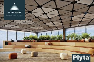

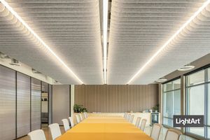
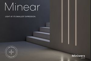
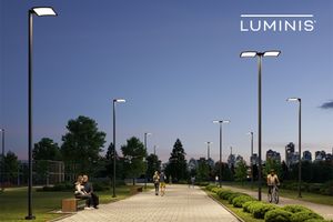
CREATIVE DIRECTION
I developed the new Landreth identity as a complete visual system rather than simply a new logo.
The creative direction established a clean, sophisticated aesthetic that could communicate the technical nature of the business while giving the company a more contemporary and recognizable presence.
SIMPLIFY
Create a cleaner identity that would improve recognition and provide greater flexibility across applications.
ELEVATE
Develop a more sophisticated visual language appropriate for architects, designers, and other design-focused professionals.
DIFFERENTIATE
Move beyond conventional lighting-industry aesthetics to create a brand with its own distinct personality.
CREATE CONSISTENCY
Establish a visual system that could translate seamlessly across print and digital communications.

BRAND EXPERIENCE
The identity was designed to function as a flexible system, allowing Landreth to maintain a consistent and recognizable presence across different communications and customer touch points.
The project included:
* Logo and brand identity
* Visual identity system
* Corporate communications
* Marketing materials
* Website design an logo data base
* Digital brand applications
DIGITAL EXPERIENCE
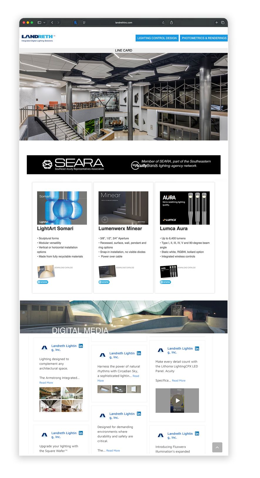
The website extended the new identity into a contemporary digital environment.
The design focused on clarity, organization, and visual sophistication while making the company's capabilities and industry expertise easier to explore.
The result was a digital experience that felt consistent with the new positioning and provided a stronger first impression for architects, designers, contractors, and other industry professionals.
DESIGN SYSTEM
A key part of the project was creating an identity that could grow beyond the initial logo.
Typography, color, composition, imagery, and layout were developed to work together as a cohesive system. This gave the brand the flexibility to communicate consistently across everything from everyday business materials to the company's digital presence.

MY ROLE
I led the creative design development of the brand from initial concept through implementation, establishing the visual direction and translating it across identity, communications, and digital experiences.
THE RESULT
The new Landreth identity created a more contemporary and sophisticated brand presence while preserving the credibility and expertise that defined the company.
The project transformed the brand from a traditional industry identity into a more cohesive visual experience. It was designed to resonate with a sophisticated B2B audience and provide a stronger foundation for future growth.
For me, the project demonstrated an important principle of brand design. Modernizing an established company isn't about changing everything. It's about identifying what has value, understanding what needs to evolve, and creating a visual system that moves the brand forward.